Melin Homes
Melin – a housing association based in South-east Wales provided homes and services to people within five local authorities.
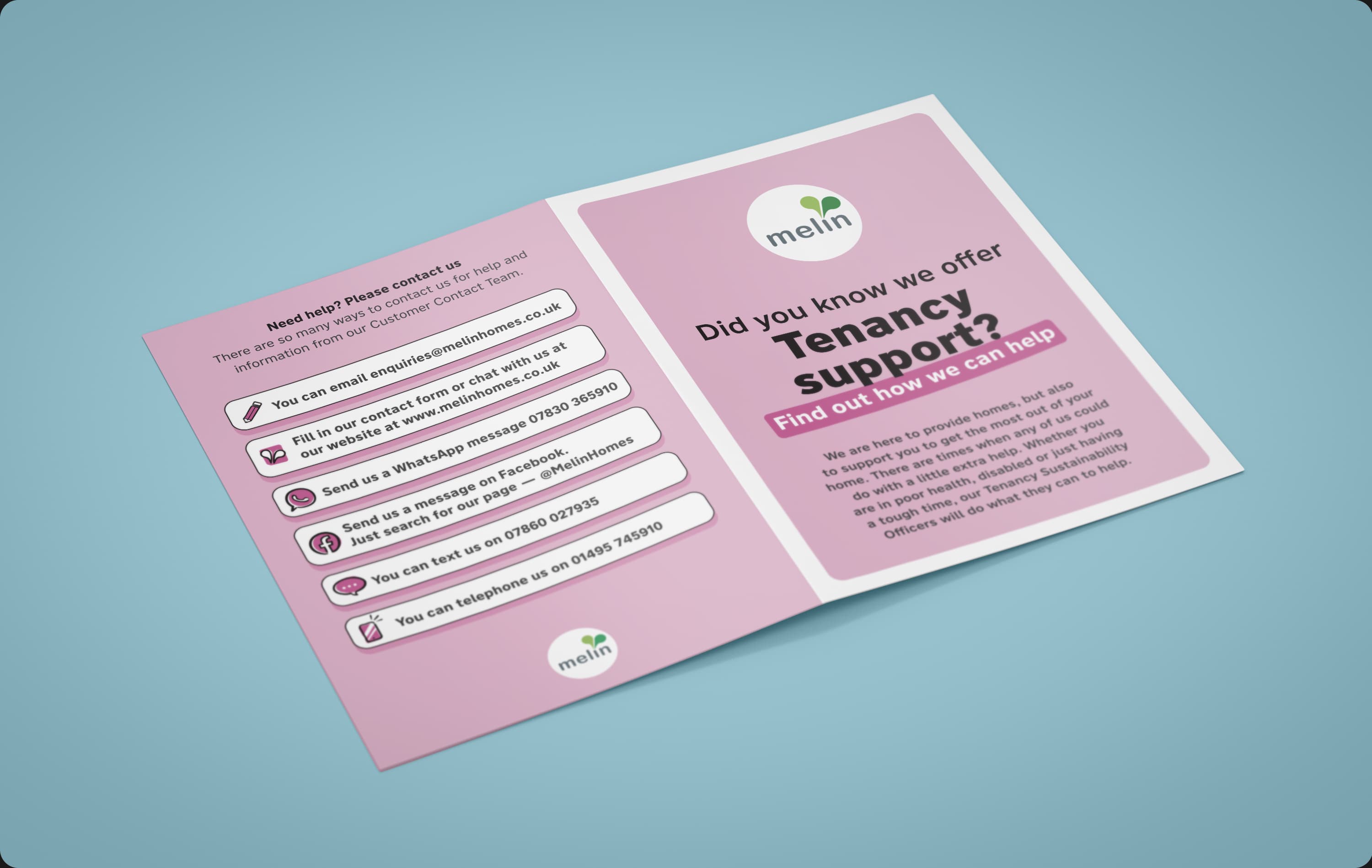
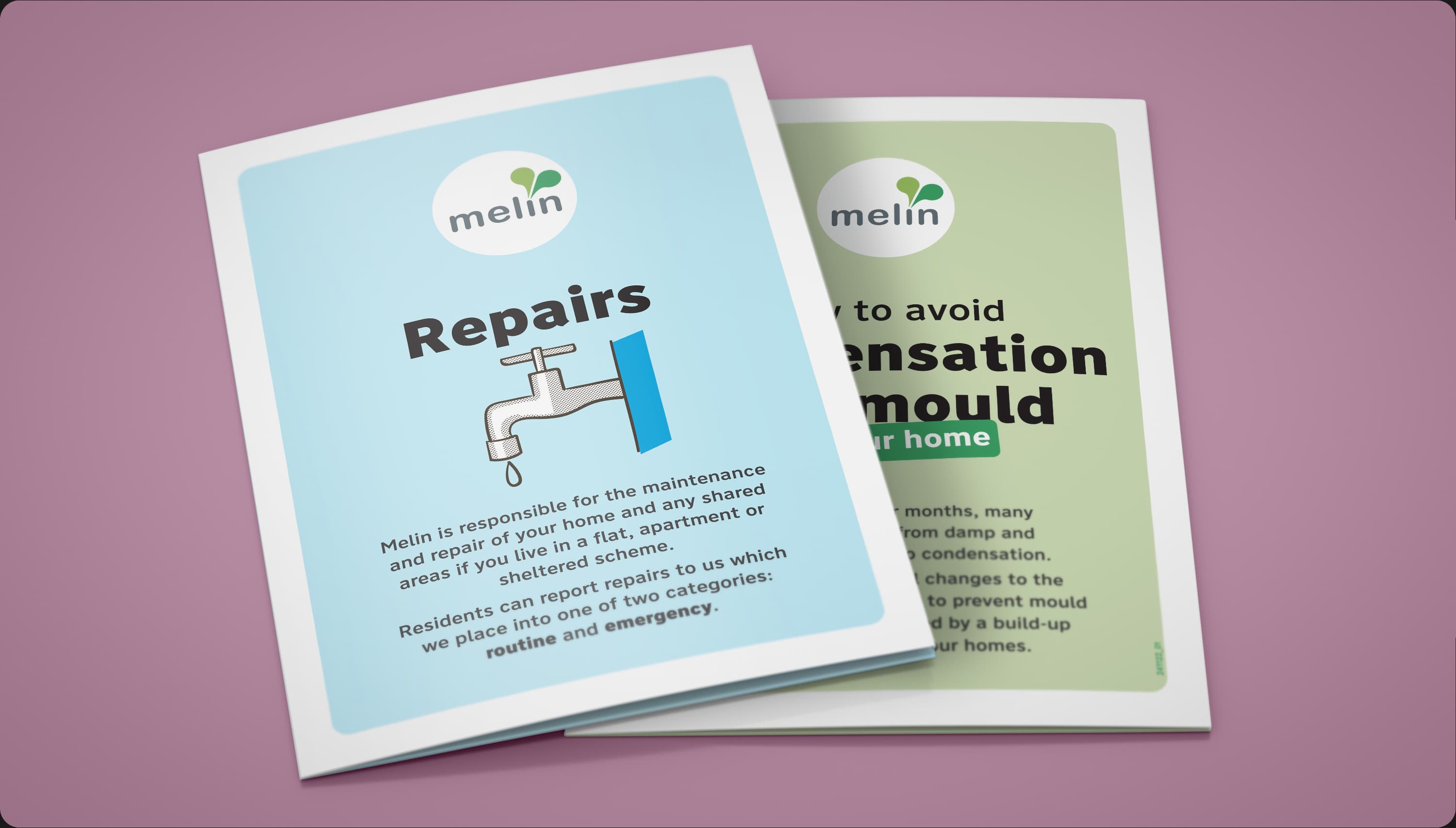
My work involved developing the logo into a full brand identity ranging across all digital and printed touchpoints. Focusing on accessible design, I put together a friendly, clear, and easy to understand design system.
—
Services: Brand identity development, illustration, printed booklets and leaflets, vehicle livery, exhibition stands, signage, and brand guidelines.
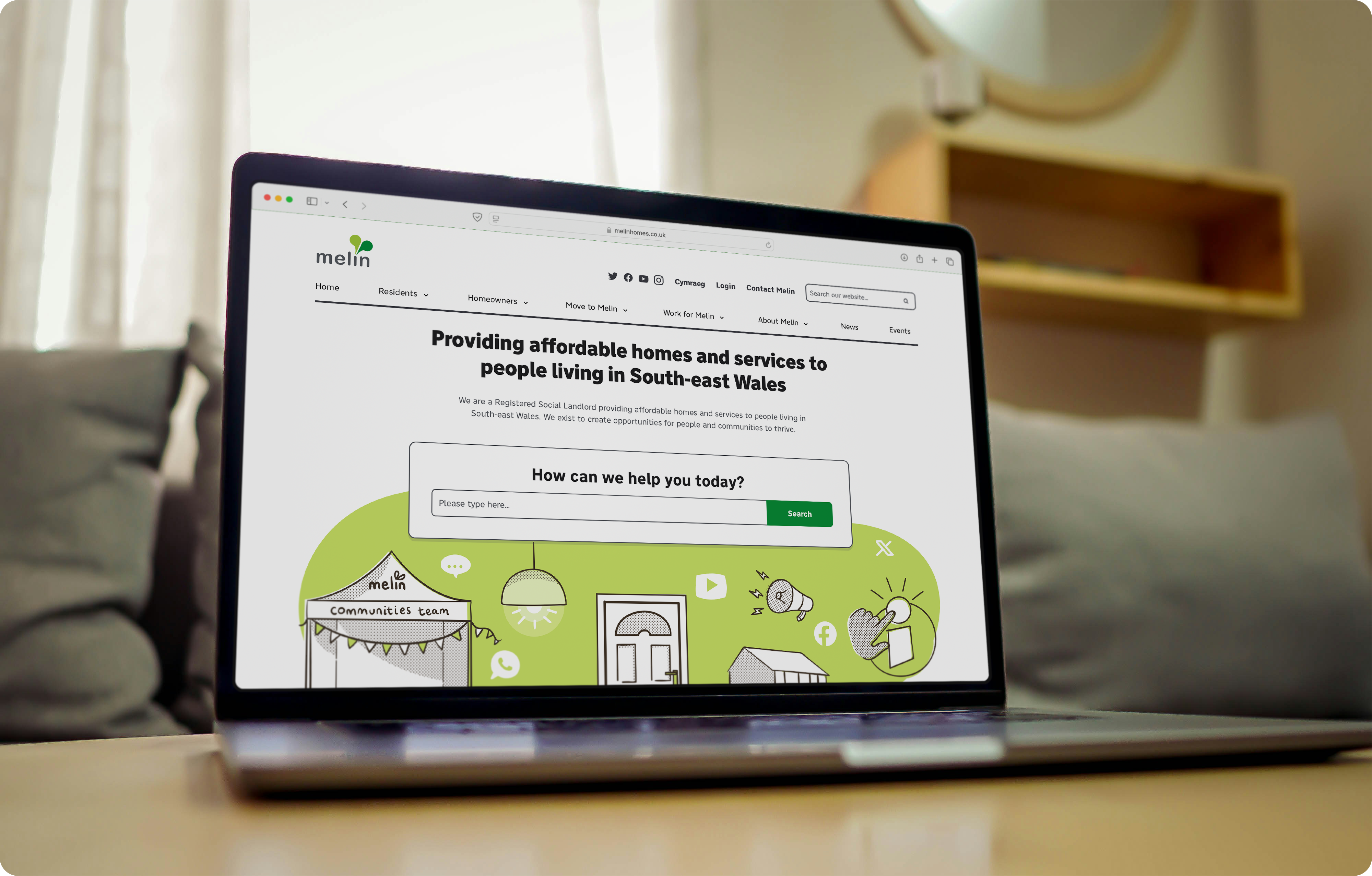
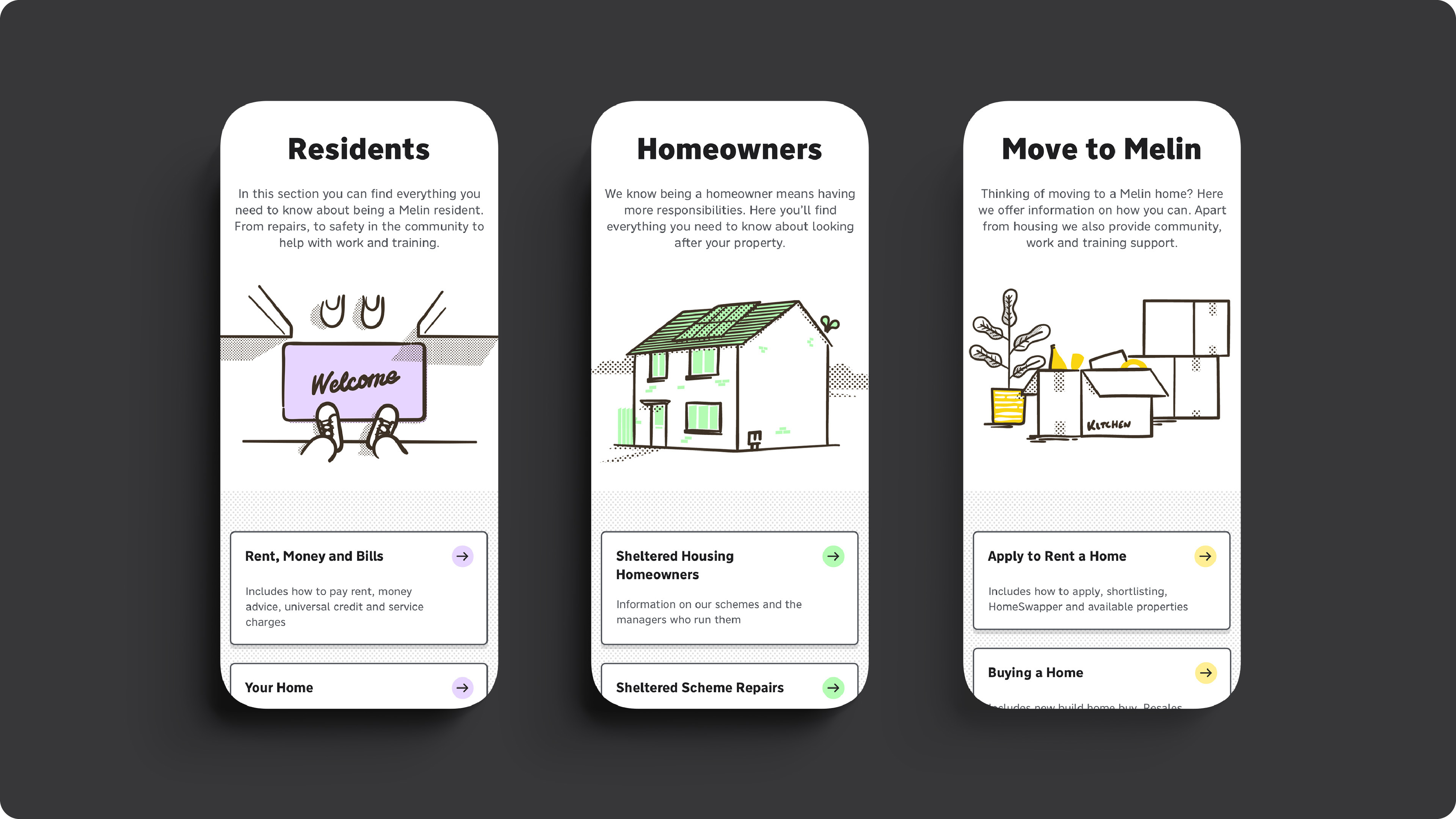
Website designed and developed by Toward Studio.
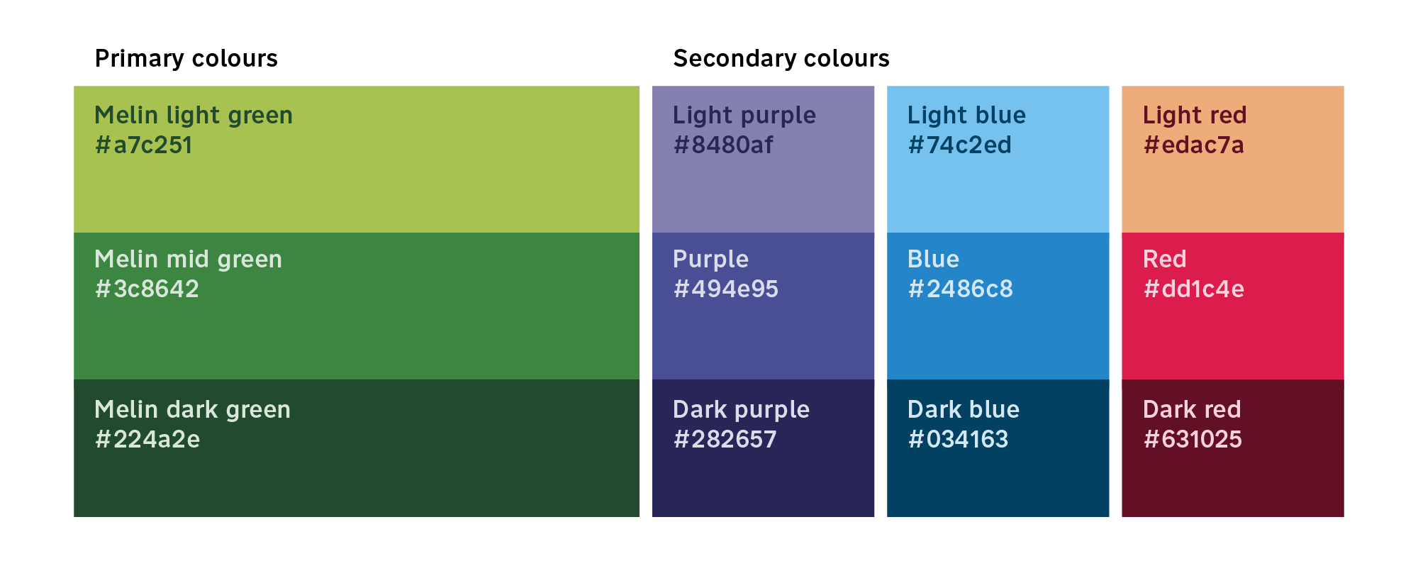
Melin's two greens had existed since its inception as a merger between two former housing associations. Through brand development, I tweaked the colours and added a darker shade to better work accessibility and contrast. To aid the main colours I added a range of secondary and tertiary colours to help work with categorisation of information and liven up the illustration.
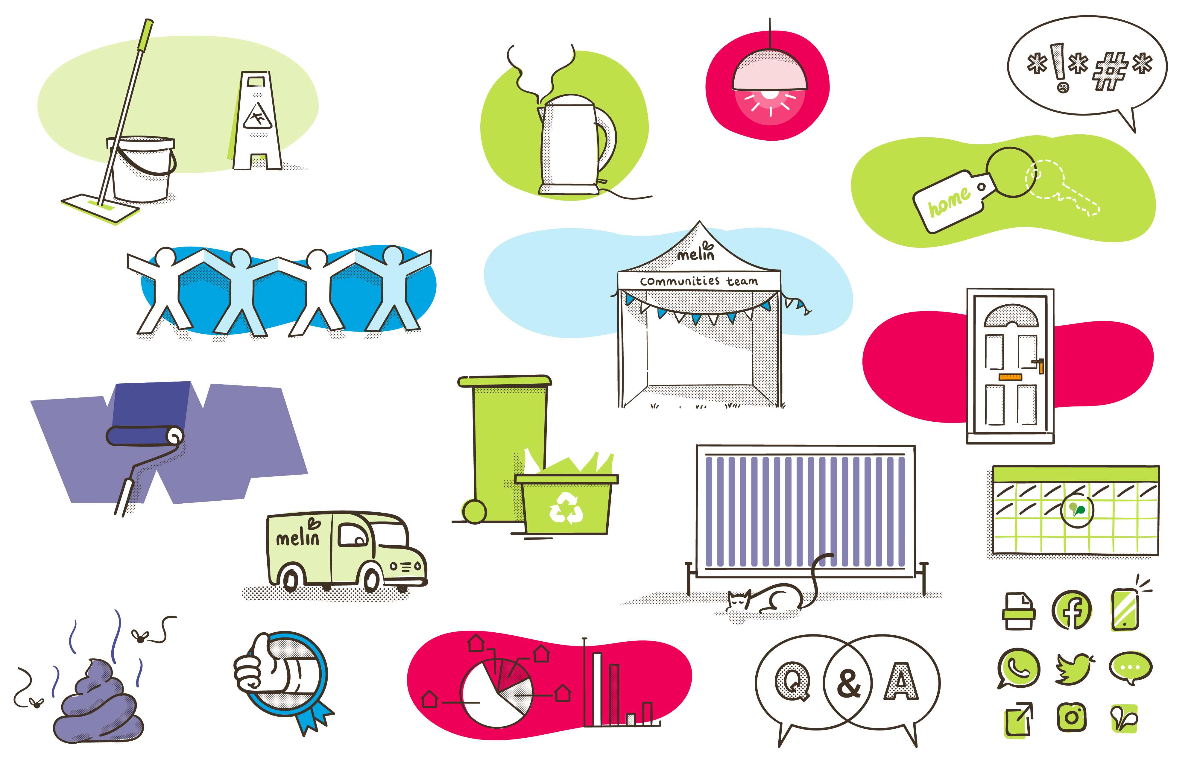
I produced an ongoing series of illustration to give Melin a more inidividual style that stood out from the usual stock illustration that local housing and council's usually use.
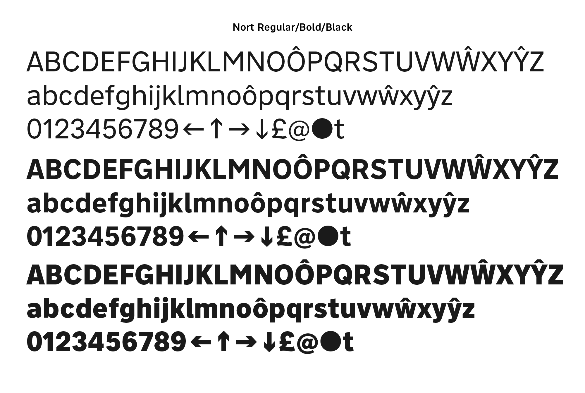
To improve accessibility I introduced the FF Nort font family, based on the Transport signaling typeface was created for British street signs in the late 1950s. Using only regular and bold fonts to comply with RNIB guidelines, Nort was the perfect font family to cover clear legibility in both English and Welsh.
Image courtesy of Toward Studio.